There is a reason that we tackle aesthetics after strategy – it’s easy to get so caught up in having a ‘pretty’ instagram feed that we forgot about what we’re trying to achieve.
Now that you have your content strategy nailed, it’s time to make sure it’s aesthetically pleasing.
Creating a beautiful aesthetic
1. Choose consistent tones give the grid cohesive ‘feeling’
Consistent tones and color scheme are one of the main factors that make an instagram account feel consistent. Look at some of your favourite brand or influencer accounts – you kind of know what to expect with their photos, and they always have a similar ‘feel’ even if the content is different.
Using images with more negative space (simple backgrounds) and a consistent editing style when it comes to brightness, contrast, saturation and color tones can make a huge difference.

These 4 examples all use different tones, but they are all very consistent within their own feed. For Keira it’s lots of soft neutral tones, not too much contrast and desaturated greens and blues to keep her feed feeling warm. Audrey’s feed is vintage and warm, and each image has been edited with consistent color tones even though the locations have changed for each one. Jess uses more ‘real life’ color tones, but each image has one or two major color tones, with rich blues and oranges throughout. Finally Cafe au lait uses images and quotes, lots of neutral tones and simple graphics.
While a filter can help and professional editing in Lightroom is ideal, even just thinking about your tones before you take or curate any images can make a big difference!
2. Use repetition in poses or image types to build consistency
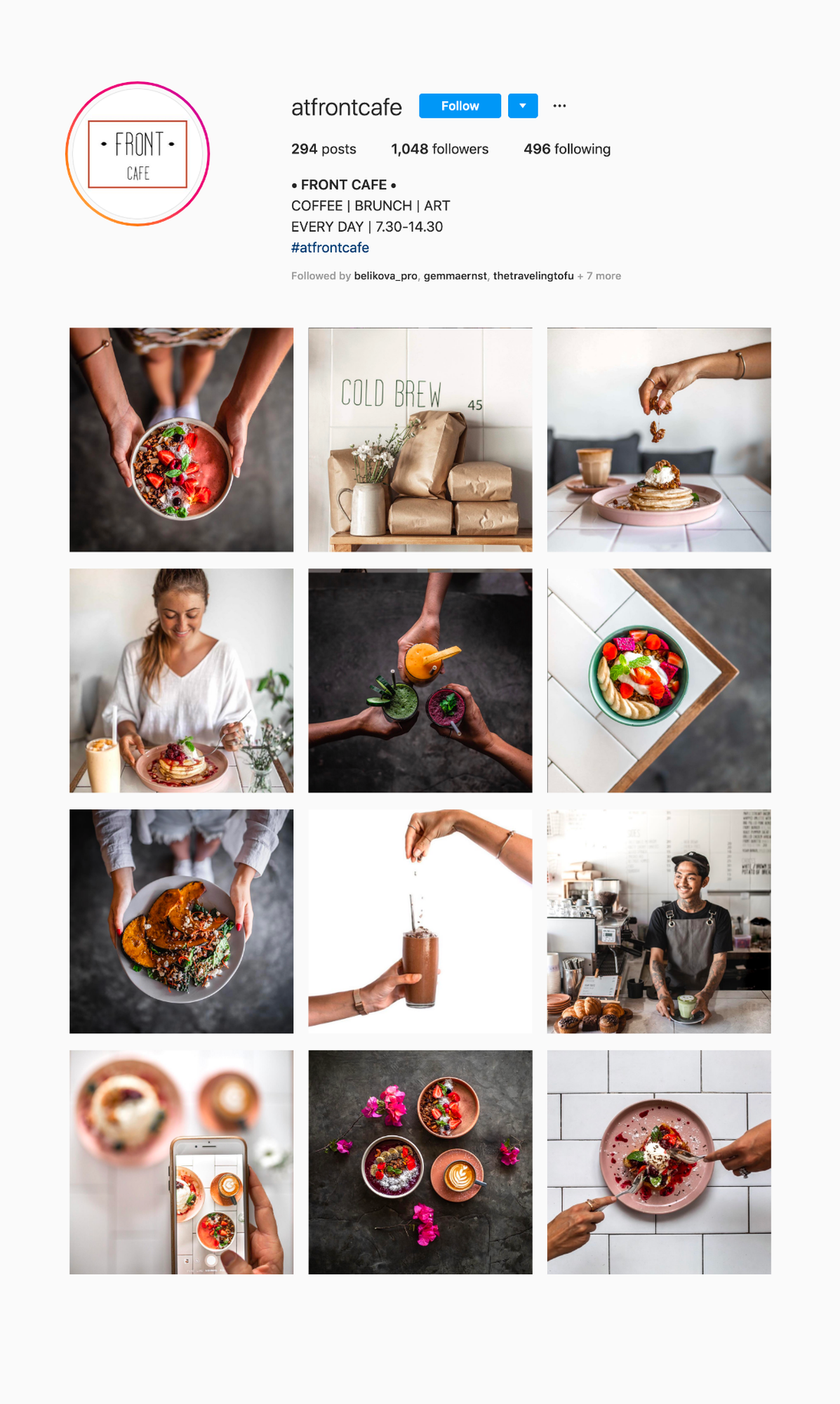
This feed that we put together for @atfrontcafe we used a couple of consistent angles and shots to make the feed feel more consistent. A mix of flat lays on two backgrounds, holding a bowl or plate and shooting from above, or using the edges of the tables. By using this technique we could add visual interest and appeal, but still maintain the consistency over time by repeating those poses and angles.

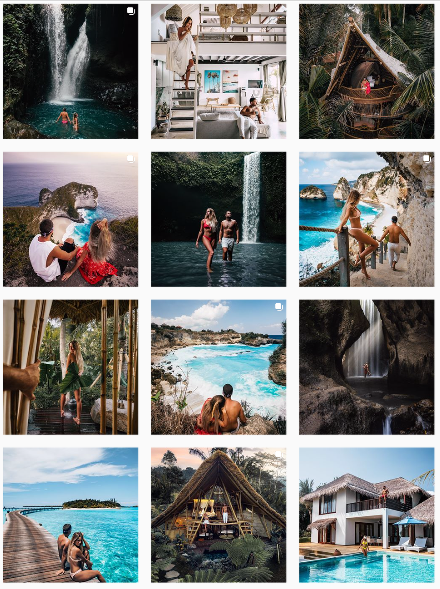
Emilio @eyesofanomad consistently features close up editorial style shots, far away wanderlust style travel photos and epic landscapes.

For Claudia & Kaan of @thelosttwo they are careful to add visual variety to each set of 9 or so photos that appear next to each other but if you scroll through their feed you’ll see repeated patters in the types of posts and the mix of close up and far away shots.

For Alex Hossick Collections (a new jewellery brand that’s about to launch) we used a mix of lifestyle images from their editorial style photoshoot, product images from the studio shoot (shot on sand specifically to match the rest of the feed) and curated inspiration images that emotively fit the brand as well as the visual aesthetics.

3. Alternating patterns is a simple way to make your feed look amazing.
This is a strategy Jenna Kutcher has used to build out a stunningly simple looking instagram feed - if you look closely every second image has a white, or mostly white backdrop. This adds visual space and avoids it ever feeling too busy.

For El Kabron, a cliff-front bar in Uluwatu Bali we put together a grid that included a pattern of light and dark images, with and without people. This is just as intentional as alternating every second image, but can look a little more organic if you don’t want to stick to a checkerboard pattern.

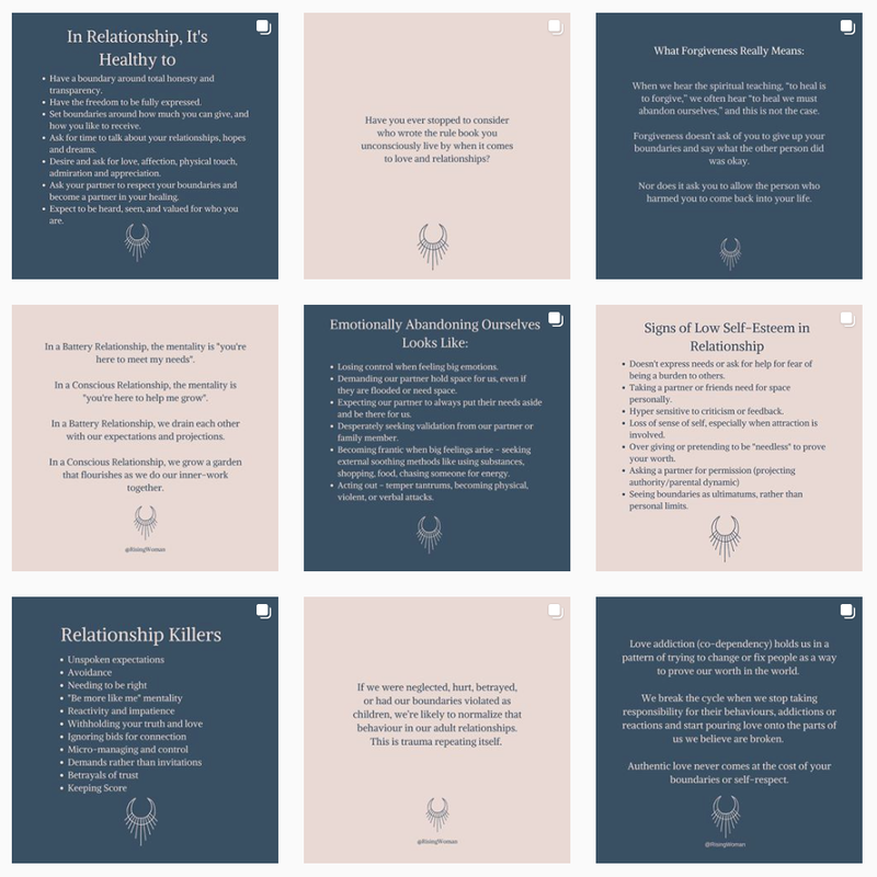
Here’s another really clear example of color blocking by @risingwoman, where their audience expects knowledge filled posts that they can save for future.

Activity
- Define your color tones and find 3 - 5 examples of accounts that use those tones.
- Looking at the content ideas from yesterday’s activity, decide what pattern you plan to use to build consistency in your feed.
When you combine these two approaches, of first building out a content strategy and then finding a way to make that aesthetically pleasing you are setting yourself up to have a strong account that your target audience just can’t resist following.
Enjoy today.